Sunday, September 12, 2010

Flower Soft Birthday


100_2314

I know it has been awhile since I posted. I have been occupied with family things and also my card making mojo has gone on an extended vacation. Cards for fun don’t exist right now, but cards for birthdays still have to be made. I took the easy route, and made this using Flower Soft 3-D elements. This is from the Spring window collection. I made it for my sister and hopefully by now she has received it. These are very easy to put together, just cut, apply foam tape and glue flower soft down. Here is a close-up:

100_2315

There are three layers to the window. As I wrote to  my sister, who has a window without a screen? Not down here in the South I tell ya. I would also love a garden like this to look at. Chuck has a green thumb, but so far, my view isn’t this. I did make another one of these in a different season for a certain store owner, but the darn camera batteries are dead and I can’t find anything to steal them from.

Oh well, another exciting week ahead…two council meetings this week, Hurricane Igor 2200 miles out to sea and heading west (the models show it curving north, we will wait to see) and I am on the hunt to find a cheater recipe for PF Chang’s lettuce wraps! Til next time… Live, Love, Laugh

Sunday, August 1, 2010

Groovy Snowpeople

I spent the day playing with snowmen (and women). With it being so hot here in Florida, it was nice to use stamps that gave me the feel that it was actually colder outside. This month at the Make It, Take It Claire is spotlighting some of the new sets from JustRite. (click on any picture to see a larger image)

100_2229

The card above is the one I will be teaching. I began by using my Labels 12 die and cut a shape through the patterned paper and cardstock. I stamped the image with Memento ink and colored with Prisma pencils and gamesol. The pp is from Bo Bunny and it really glitters. A few strips of cardstock and some cream ribbon from May Arts are across the top. I used metallic pens on the hat and snowflake for some bling. The small snowflakes are from Hero Arts.

Claire likes us to prepare an alternate card to show the versatility of the stamp or set in this case. The following are the other stamps in the Groovy Snowman set:

100_2231

100_2230

The top left was made with a scalloped card by Paper Cuts. I colored the image with Copics. The outer ring is popped up on foam squares and the bow is made with some red cord. The card on the right used some Basic Gray Eskimo Kisses paper. The image is also colored with Copics. I layered a few scalloped circles under the image and each one is popped on foam squares. I found a bit of old SEI ribbon and was determined to use it on this card so I made a few loops and added a snowflake in the middle to hold it together.

100_2232

For the fourth image, I made this tag inspired by Tim Holtz. I stamped the images with Vintage Sepia ink. Other than the snowman, the images are from Inkadinkadoo. Using a blending tool, I sponged Fired Brick, Antique Linen, Bundled Sage, Tea Dye and Walnut Stain. I distressed the edges with my TH tool and rubbed the Walnut Stain along the edge. I added a tree brad, stickles in Holly and Christmas Red and fiber (the fiber looked so much better than the white string that came on the tag).

My goal was to show how versatile the stamps are with the four different looks I created. Hopefully it was achieved :)

Monday, July 12, 2010

Little Pieces of Quiet

 When I first saw this image, I knew I would get it to make a card for my sister. She has two little boys who are constantly around her demanding her attention. I colored this one to resemble her youngest who is 4.

100_2211

One thing about close-ups, you can see the tiny spots I miss when coloring :) I stamped him (Penny Black image) with Memento ink and colored him with these markers:

100_2212

I saw that the challenge this past Saturday on the Penny Black Challenge site was a sketch challenge so that is where my layout came from. It is a 6 by 6 square card (no worries as I will hand her the card Wednesday night) made with Bazzill cardstock. The patterned paper is new Basic Grey Oliver (brads too). I used my Nestie circle, scalloped circle and tiny tag sets to cut out my image. For the bottom piece I used my SU scalloped border punch. 100_2208

The inside has the sentiment that reads “Just working on that piece of quiet you said you wanted.” I think she will like it. How can you stay upset with someone that cute?

Tuesday, July 6, 2010

Revisiting Thinking Inking week 1

 A good friend of mine has decided to revisit the Thinking Inking Challenge from last year. Originally posted by Jennifer McGuire last year on 2peas, Jan (Far North) has brought the challenge back to life this summer. To get all the information in case you would like to follow along, click here and it will take you to Jan’s challenge post.

100_2207

       (click the image for a larger picture)

The challenge is centered around using Distress Inks which I have plenty of. They sit there quietly stacked on top of each other with their neat label affixed. Sadly, they don’t come out very often to play. With my creative mojo absent lately, I thought this would be a stress-free venture.  The first three videos are the basics of what the inks are capable of. My tag is fairly simple. I used the following inks on it: Black Soot, Wild Honey, Broken China and Bundled Sage. I took the picture so you could see the full image on the stamp. I stamped and embossed the image with clear powder first. After using the blending tool to apply the inks, I spritzed the tag with water, but I guess not enough because I don’t really see the splotches. Next I sprinkled Kiwi perfect pearls and hit it with the heat gun.  I choose the sentiment to go along with the butterfly image because what better to represent a change than a butterfly! I stamped partial images of the stamp on the tag and added a few black rhinestones. The flower began as a white flower but I sponged broken china and bundled sage so it would match the tag. I also sponged ink on my twine for the top of the tag.

While my card mojo is on hiatus, I am busy with my cross-stitching. I am about to begin an afghan. Guess what design will be on it? Butterflies! I have been eyeing the Zweigart Butterfly Garden kit in magazines these last few months. I refused to pay the $80. After doing a google search, I found the booklet for $9, only had to buy 8 colors of yarn (i have a huge stash of colors that I never got rid of) and got the afghan at Joann’s with my 40% coupon for $17.99! I was stoked. If I finish it by Christmas, it will be my present to myself :)

Friday, July 2, 2010

Remaining “class” cards

 I spent the rest of the afternoon creating these three cards for my Mom and her friends. The first one actually has watercoloring on it. If you know me well, you know I don’t like this coloring medium. I am pleased with this image though. I used cold press paper which I think made a big difference.

relax watercolor

The image and sentiment are by GinaK. I wanted it to have a summery feel. I layered the image with SU Pink Pirouhette and Regal Rose. Behind the patterned paper is Pesto coredinations.

The next card uses the shaving cream technique. I used Bashful Blue and Mellow Moss re-inkers for this. shaving crm for youThe sentiment is new from JustRite Designs. I used coordinating paper for the sentiment and popped each one up on foam strips.

The final card used the shaker kit from Impression Obsession. bfly shaker  

The wild flower image is from Penny Black, the sentiment is from IO and the butterfly inside the shaker is from Memory Box. If you click on the picture it will enlarge and you can see that I lightly colored the wings and added some microfine glitter. Inside the shaker is Sweet Pea Flower soft with a hint of lavender.

I think the ladies will enjoy working on these, don’t you? Now to just cut out the kits!

I am back…with a card!

 I know it has been almost a month since I posted. I had some family business to attend to but I hope to get back to blogging and making cards on a more regular schedule. On top of the family commitment, my laptop monitor died. I ended up purchasing a new one since it would have cost $200 just to get a new monitor. I am now working with Windows 7 and getting used to the little messages my computer keeps giving me. It took me two entire evenings to upload all my bookmarks and favorites. Luckily I was able to get my information off my old hard drive.

But on to the card. My Mom asked me to put a few cards together that her and her friends could come over and do. They are not advanced stampers (actually only my mom stamps) but I wanted to do more than just a one layer card. They are hoping to work on 4 and here is the first one.

pink just because

The image is by Hero Arts and the sentiment by Verve. I colored the image with my copics and added a bit of Platinum stickles in the centers. The embossed panel was done with my Cuttlebug and the Harlequin folder. I also used my SU scalloped border and MS butterfly punches. There are actually 7 layers on this card, but it really isn’t bulky to mail. Although the buttons might give the USPS heartburn going thru their scanners:)

I need to get working on the other cards for these gals. Check back later, you never know when there might be a new post!

Sunday, June 6, 2010

Tilda with spring bundle


100_2166

Tonight I wanted to make a card just for me. I had ordered this cute Tilda a few weeks ago and finally inked her up. I colored her with my copic markers. The colors were picked to coincide with the Melissa Francis (Ella and Josaphine) paper for the background. After stamping the image I used my Labels 10 nestie to cut it out. For the middle layered panel, I used a Martha Stewart border punch (the arch one). The leaves were also punched with a Martha Stewart punch. The flowers are from Wild Orchid. There is a hint of stickles on the ribbon in her hair and I added Flower Soft to the bunch of flowers. The final addition was a few Kaiser pearls on the corners of each panel. I didn’t have the shade of blue that I wanted, so I just used white pearls and a my B93 marker.

We are off to Panama City Beach in the morning for a work conference. Hopefully the oil hasn’t reached there yet. The family is coming along because we have never visited that part of Florida before. I hope you enjoy the rest of your weekend.

Wednesday, June 2, 2010

Celebrating You

 This card was made so I could use another new stamp in my collection. I picked up this Penny Black slapstick Irises last week. I love this style of flower stamp. I pulled out my watercolor crayons, spritzer and I must say, I am happy with my first try. I usually have to try 3-4 times before I am happy with the look.

100_2165

I used my Swiss Dot CB folder on the pink and light blue panel. The sentiment is by Verve, the butterfly is a Martha Stewart punch (it is covering up a small tear when I adjusted the ribbon!), and the pearls are from Basic Grey Opalines. I am happy to say this card fulfills three challenges. The layout is from Mojo Monday 141, the color scheme is from Cuttlebug Challenge and on A Spoonfull of Sugar the theme is celebrating. This might become a card for my Mom (who’s surgery was delayed until next Monday) once she is fully into therapy. I don’t want you to get the wrong idea….she is having a full knee replacement. Didn’t want you to think she was going to detox (wink). The week is half over so we are counting down to the weekend and our trip to Panama City Beach. Hopefully the oil slick stays away at least another week for us!

Monday, May 31, 2010

Cards from the weekend


blowing get well wishes cs

This weekend was a nice three day weekend. I had planned to participate in the Virtual Stamp gala over on Splitcoast, but alas….it wasn’t to be so. Friday night began with a party for our youngest. He turned 17 and invited 17 of his closest friends to celebrate. Saturday was cleaning and laundry, Sunday ran errands (and had dinner at Bahama Breeze) then today was yard work. I was determined to make my mom a get well card for her surgery tomorrow, so I looked at the various challenges and incorporated a couple for the card above. The first was Splish, Splash (use the colors blue, white and grey) and the second was Watermark (use versamark on your card). I was also able to throw in butterfly (ribbon from BSF thanks ;) and a heart so I can add Flutterby Wednesday and The Shabby Tea Room to the list.

My second card is the one I made our son for his birthday. I just bought this set from Stamp and Deliver and wanted to ink it up.

100_2158

100_2156

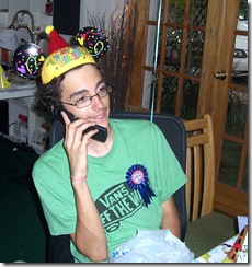
Yes we freely humiliate our children by making them wear birthday Mouse ears. The button was all him. He is listening to a fine rendition of Happy Birthday from his cousins in GA.

I hope you were able to enjoy the weekend. Did you know there is only 207 days til Christmas? Start your shopping early to avoid the rush!

Monday, May 24, 2010

Flora and Fauna with a Maggie


100_2152

I was able to work on a card tonight after dinner. Naturally, the first place I went to was 365 Cards to see their challenge for today. Pam wanted us to use both flora and fauna and they had to come from different sources. I have not been able to play with my Maggies for a while so I pulled those images out first. Next I went to my patterned paper and looked for one that had wildlife on it. The image was colored with copic markers and I used a bit of diamond Stickles on her wings.

100_2150

To finish off the card I used a rose by Prima, the pearl flourish is from ZVA and the sentiment is by Inkadinkado. I wish it was a bit more fitting for my son’s birthday. He turns 17 on Friday. Do you think he would care? Just kidding, maybe tomorrow’s challenge will be more appropriate!

Sunday, May 23, 2010

Blog Candy Winners...

Last week I announced I had blog candy for playing my eye spy game on my messy desk. I had two people guess and they were both correct. So Amy T. and Heather (this and that) please send me your address and I will get a prize pack out to you. Please put blog candy winner in the subject line. You will find my email info in my profile. Thanks !

Wednesday, May 19, 2010

Asian Influence


100_2128

Today’s card was created for two challenges. The first one is on Flutterby Wednesday. Danni asked us to include a butterfly and flowers on our card this week. Easy enough, I love both of these elements. The second challenge is found on 365 Cards. We had to convey the theme of friendship without using a sentiment on the front. I went with a different take on the theme and began by stamping a faux postage layout image. I sponged Versa Magic Pixie Dust and Memento New Sprout ink inside the areas. Using a variety (ok 3) Asian images, I stamped them inside. I also used my Cuttlebug Autumn Type embossing folder and cut out the word friend. I used a Punch Bunch to cut out the butterfly. Kaiser rhinestones and pearls were added to the panel. To finish the card, I used my Fiskars scissors to cut out the white panel and layered this on a piece of SU Certainly Celery and a card base of Pretty in Pink.

I just finished watching American Idol and I am thrilled with the final two; Crystal and Lee. I will not be upset with either one of them winning next week. I am off to bed now so I can read James Patterson’s 9th Judgement. I started it during lunch today and it is hard to put down!


Tuesday, May 18, 2010

Day 79 color theme for Dad


nautical dad

I struggled with the title of today’s post. My first thought was Nauti Bird. Then a Pelican for Pops. You can see I just went with the challenge theme.  Today’s card is based on the color theme for Day 79 at 365 Cards. When I looked at the colors this morning on my break, I immediately thought nautical. Most others doing the challenge went patriotic. I guess is was the different shades of blue that my brain focused on. I choose the set Guiding Light by Gina K Designs. I am very proud to say that all the cardstock (except the base) was pulled from my scrap bags. I stamped the image in black and colored it with copics. I used my Labels 4 to cut out the center panels. I sponged Memento Summer Sky and Versa Magic Wheat for the background. The netting is also from Gina K. The birds flying near the sentiment were stamped in Memento London Fog. I added a bit of Flower Soft in Sand for texture at the base of the image.

I am doing quite well keeping up with the challenges this week at 365 Cards. I just might make the weekly all-stars!

Monday, May 17, 2010

Shoe Shopping!


100_2121

What do you do when you have some extra funds at the end of the month? Go shopping. Today’s card combines Day 78 at 365 Cards with the sketch from Mojo Monday. The challenge we were given was to imagine Money. I took the theme and choose something we do when we have some extra cash. I began with the MFT set called Window Shopping. I colored the image in with copics and paper pieced the dress. All the patterned paper came from the SEI pack Claire. The brad is also from SEI and I used a bit of scrappers floss to hang the sign. What makes me laugh about this card is that I really don’t like to shop for shoes! I know most females love this, but if I could get by with the same pair each day I would!

Sunday, May 16, 2010

Out of the box, err I mean Oval


100_2117

That title caught your attention I bet. It has been a week since I have really been able to work on a card/challenge. Being out of town at a conference was part of my obstacle, but I have also strained a muscle in my lower back. Staying in one position for any length of time is painful. Today’s card is made for two purposes. It follows the sketch at 365 Cards and it will be my swap card for the animal theme on Thursday night at Stamp & Deliver. Let me show you the entire card:

100_2114 To explain the title of this post, take a look at my stamped image. I used my Large Scalloped Oval nesties, but didn’t want the bird’s wings cut off. I used the Out of the Box technique. Start by stamping your image. Lay the nestie on top and see what part of your image lays outside the edge. Trace the inside of the nestie close to the image. Using scissors, cut the image out that lays outside the nestie. When you place your die-cut back down on the image, flip the cut image on top of the metal die so it is not cut out. If this sounds confusing, please go to SCS, there is a tutorial on there. After cutting out the nestie, I colored the mouse with a base color and then mixed Toffee and Sand Flower soft to obtain the color I wanted. I also glued plain Sand down around his feet. I finished coloring the image with copic markers. I added some dashed lines around the oval to help it stand out. The card base is SU Almost Amethyst and the pp is SU Tea Party. I popped the oval up on foam tape and glued a few Robin’s Nest dew drops in the corners. Now to just make 3 more!

Lately I have seen bloggers showing pictures of their work space to see if they are “clean” crafters or “messy” crafters. You decide!

100_2118

For you eye spy fans, can you find two entirely different types of candy? Leave me a comment with the correct candy names and I will send out some blog candy. I will take comments all week and announce the winner this weekend:)

Thursday, May 13, 2010

Tattered Flowers


100_2110

I saw this card on Ellen Hutson’s classroom and knew that I wanted those die cuts. After a call to Stamp & Deliver I discovered that she was sold out of these. Determined to have these I looked at Ellen’s store and she had them in stock! With her excellent customer service they were waiting for me yesterday when I returned from a conference. You see, Mom’s birthday is tomorrow and I really wanted to use them on her card. I used paper from the Mariposa DCWV stack. I distressed and inked the background layer with Antique Linen. I used Tattered Rose on the flower and Bundled Sage on the leaves. I did use a small piece of foam between each flower layer. After I took the picture I thought the flower needed some shimmer so I spritzed it with Shimmer Frost. Much better:) The center is from Prima that I had just picked up. What timing!

I hope to get back in the swing of things and make some more cards for the challenges at 365 Cards. Keep checking back…you never know when you will see a new post!

Sunday, May 9, 2010

Sunday sketch and MITI

 Happy Mother’s Day to all the Mom’s reading this! Today’s cards are for the Super Sketch at 365 Cards and from yesterday’s Make and Take at Stamp & Deliver. As always, Pam gave us a wonderful sketch to follow. I began by taking my new Basic Grey Max & Whiskers paper pad and choosing the papers. After looking at the colors of the paper, I thought the image stamp would look good in brown ink. The stamp is from Limited Editions and the sentiment is SU.

100_2088

The following cards are those from the store. The theme this month was masculine cards and these really fit the bill.

100_2095  100_2093 100_2091100_2089

They were all fun to create and it is always fun to get with the ladies at the store. The top card with the vintage car was super easy (no stamping). Just cut out the car and add some patterned paper. The next card (lighthouse) was stamped and then colored with pencils. The background paper really makes the card pop. The fishing martini was stamped twice and the top of the glass colored and cut out. We popped it up on foam. I added some diamond glaze to the glass when I got home. The final card (3 bird profiles) is very elegant. We stamped it in brown ink and used chalks to color. The background panel was run through a crimper and then the mulberry paper added on top. It is hard to see, but we used a gelly pen to outline the flowers and the squares. Now to decide which one my hubby gets for Father’s Day!

Enjoy the rest of your weekend. We are heading to my son’s for a cookout. He has teriyaki glazed steaks, shrimp kabobs and twice baked potatoes! This from someone who doesn’t cook! Thank god for the butcher shop on the corner :)

Wednesday, May 5, 2010

Day 66 the 3 W’s

 Today on 365 cards Pam gave us another trio challenge. Actually, she is going to do this all week! Today was W’s : white, white space and wings.

100_2084

In case you haven’t noticed, I love butterflies, so the wings aspect was right up my alley. I have had this stamp and I don’t think I had inked it up yet. I hate to say, but I do tend to purchase stamps and don’t get a chance to ink them up before they are put away. I had the oval already cut out, so green was my hint of color. I used my scor-pal to make a few definition lines. I had some green pearls, but they were not the correct shade so I whipped out my G24 copic and colored a few white ones. These looked passable. I used a gelly pen to go over the trails, but it was very hard to pick that up in the photo. It didn’t help that it was a white card in a white photo cube. Even the piece of green cardstock in the back didn’t help too much. Trust me on this element.

There is still a few hours left of Cinco de Mayo so party like you are a Mexican!

Tuesday, May 4, 2010

Day 65 with 3 A’s

I popped on the computer this morning to see what the challenge would be on 365 cards and lo and behold….3 A’s: alpha stickers, arc and anniversary! 

100_2082

I knew I had a few alpha stickers to choose from so that was ok, and the anniversary theme didn’t scare me, but creating an arc did. I came home to some new Basic Grey Cappella in the mailbox so that was my background. I used La Creme and SU cardstock for layers. The image of the hands is from GinaK and the sentiment is from JustRite. Roses and pearls are added for a bit of elegance. If you click on the card to enlarge it, you will see that she has a small pearl for a ring also! As you can see, I used the alpha stickers to create an arc. Now if any of you are engineers, please don’t measure my angles on the letters:)

Monday, May 3, 2010

Once Upon a Time….

 The challenge today at 365 cards was to use 3 F’s. They were fringe, fairy tale and favorite color.  I began with the fringe and worked from there. They came from a fiber pack of Sugared Basic Grey.

100_2075

Naturally, I pulled out my BG Sugared paper pack. Now on to the image….I am sure there are many fairy tales that involve mice in them so Penny Black to the rescue. I colored them with copics and cut out the image with my Labels 2 nestie. The sentiment is from My Favorite Things and it is how all happy fairy tales end. The hearts are Rain Dots to finish off the card. The final F is my favorite color of the moment…..Pink (she is a pretty colorful recording artist too). Thanks for stopping by today.

Sunday, May 2, 2010

Sketchy Sunday with Melissa Frances

 Today’s post is a card I made for 365 cards. Every Sunday Pam posts a sketch to follow. Here is what I created:

100_2074

I began with one of my new Vintage Ephemera Stickers that I just picked up. After selecting the image I played with my nesties to see what shape would work well for the background layer. I settled on Labels 11. I cut it out from a piece of Applesauce Bazzill paper. I love this color! While the die cut was still around the paper, I sponged Antique Linen ink inside. My Fiskars Treading Water border punch was used on another piece of Bazzill to follow the sketch. I did end up flipping the sketch on it’s side. The beautiful pink paper is MF called Henrietta. I distressed this layer with my Tim Holtz distress tool. I sponged Antique Linen ink on the remaining layers including the card base. Sorry I don’t know the name of that piece, but it is Bazzill. I used my Spellbinder Floral Accents die to cut the pink flourishes. Here is a close up for you…

100_2073 They were cut from some pink scraps that I had. I used some of my new roses from Wild Orchid Crafts and a few pearls from Kaiser. After putting the entire card together, I spritzed it with Tsukineko Sheer Shimmer mist in Frost. You can see a bit in the photo above but here is another view:

100_2069 Click on the photo for a closer view and you will see it shine. It looks so pretty in real life! I might just make this into a Mother’s Day card.

Thanks for stopping by today and enjoy the rest of your weekend!

Saturday, May 1, 2010

TSTR #7 Comforts of Home

I have been wanting to put this card together all week but never got a chance to until today. One of our most homey comforts is to sit down with a good book. With my husband working for a library, we have a lot of books with a wide range of topics. I just wish Flopsey had a small throw around his legs to complete the picture. That is how I sit on the couch and I am not talented enough to draw that in :)

100_2067
image

The picture on the bottom is what we were given for our inspiration at The Shabby Tea Room. I went with the colors of a few quilts and pillows shown. The paper is from Memory Box Frond, image from My Favorite Things, ribbon May Arts and the stud is by Prima.

Thanks for stopping by today!

Friday, April 30, 2010

Mojo Monday meets 365 Cards

 I took the day off today to just relax and regroup. Part of regrouping was to spend an hour at my favorite LSS Stamp and Deliver. Here’s a shout out to Claire (the Store Owner). She had just received a shipment of Melissa Frances paper and other goodies. I purchased a few sheets of each design

100_2052

plus a bunch of Bazzill paper. My card tonight is showing off the Rosaleen paper and I am not sure what color Bazzill as I didn’t write them down. I am going to submit this card to Mojo Monday 136 and also 365 cards circles 3 ways. The layout follows the mojo sketch and my three circles are: circle nestie, button and robins nest dew drops. The sentiment is from the new Justrite Hope set (did I mention I bought that today too?).

So tomorrow is National Scrapbooking Day….I am not a scrapper. Will it be horrible if I just try to work on some more cards?!

Wednesday, April 28, 2010

Flutterby CAS #107

 I just had time to make a quick card tonight so I looked over the challenges today and the Flutterby Wednesday challenge was chosen. Danni asked us

100_2047

to create a Clean and Simple card. (I just noticed that those are also my initials) These cards are supposed to be easy but I struggle with them. I began by picking out my background paper from Webster’s Pages. I layered that on Always Artichoke cardstock from SU. I cut and embossed a Labels 8 die for the sentiment (by Verve). I sponged a bit of Milled Lavender distress ink on the edges. I wanted to add more, but kept telling myself it is supposed to be clean and simple. I do hope the paper isn’t too busy!

Enjoy your day…who knows what tomorrow will bring:)

Tuesday, April 27, 2010

Super Sketchy Sunday at 365 Cards

 Surprise! I am back. It has been awhile since I have been able to sit down and create at my craft table. Work and family duty called. I decided to try something easy to get my mojo going. This past Sunday was sketch day at 365 Cards. To see the original sketch and the other creative interpretations, click on the link I provided.

100_2043

This is a close up of the sentiment I used from Verve. I was noticing it quite a bit on Splitcoast and finally broke down and ordered it. Do you see the rose? Is it Prima or not? Not. I ordered a few different styles from Wild Orchid Crafts and they arrived today. I will say these come from the UK but other than the short delay due to the Iceland volcano, they flew over fast. You get so many more for the money! I can’t wait to use more.  Now for the whole card:

100_2042

 I used paper from the Memory Box gossamer collection. The ribbon is from Papertrey Ink and the strip below the ribbon was made using a Martha Stewart border punch. There really isn’t more to explain. Now to just figure out who to give this to. Tomorrow is Wednesday already, the work week will be half way over :)

Sunday, April 11, 2010

It’s gonna be a boy!!

 It seems our family keeps having boys! And yes there is another one on the way. No it isn’t mine…goodness at 46 I do not want to have to start over with night feedings and dirty diapers. And no I am not going to be a Grandmother. That leaves the extended family. My sister’s niece is expecting a boy soon and she is having a baby shower. Sadly my Mom and I are not able to travel up to Savannah for the shower, so we made some special cards to send up with a gift card. First up is my Mom’s:

100_1977

The striped paper is embossed with the Harlequin CB folder. She used SU Bashful blue paper, ink and ribbon. The footprints are from All Night Media and the sentiment is from Studio G. The border punched (Martha Stewart) topper is popped up on foam dots to give it a shade effect. Nice touch :)

Next up is mine. I used Graphic 45 paper from the Bride to Baby collection. I purchased the cutest clear set from Penny Black called Bundle of Joy with the intent of using a cute hedgie on the card. But as it came together, the hedgehog didn’t look right. You’ll see what I mean:

100_1979

The card was taking a pretty vintage look, and the cutsie hedgehog was not right. But I did use the sentiment and adorable booties! I stamped the booties on a piece of the paper and cut it out using my Labels 1 die cuts. I stamped the image in Memento Rich Cocoa which is also great for the vintage feel. I edged all the paper in the ink for a softer look. There is a bit of lace, some prima flowers, a Kaiser pearl and a touch of Patina Stickles on the booties.

100_1981Here is a close-up of the booties. If you click on the image, it will get even larger. The layer of Bazzill underneath the gorgeous paper is called Patina also. A match made in heaven :)

Here’s to Shannon and the joys of motherhood!

Thursday, April 8, 2010

How Beautiful A Day

 I came across a new challenge blog today called the Shabby Tea Room. They have a weekly challenge that appears on Mondays.  It is their fourth week and the challenge was to Embrace the White. We were given this photo to use as inspiration: image

100_1976

Here is what I did for the challenge. We could use either white or cream as the main color and I choose to use cream. I have had this paper from Anna Griffin for years. It was probably one of the first sheets I ever bought 6 years ago. I used a border punch from Fiskars to create the scalloped edge. I utilized the portion of paper that had both the cream and pale lavender on it since it already had the defining line between the two shades. I pulled out many embellishments and even cut out a few nestabilities to see what would look good on the card. I choose this butterfly with the sparkle on its wings and the acrylic layer.  It is soo pretty in real life. The flower is from Prima and the sentiment is by Verve.  I used some pearls by Kaiser to make the trail. After checking the challenge on Flutterby Wednesdays I am going to submit the card for that also.  Danni and her design team asked for a card with some sparkle and this butterfly fits the bill.

My second card tonight is what I will use as my alternate card for Saturday’s Make It Take It. Sadly, I didn’t take a photo of the card that I will be demoing before I turned it in.

100_1970I began by stamping the teapot and cups (Great Impressions) onto a Labels 11 die cut. Next I stamped the pot and cups onto scraps of paper and cut them out to paper piece them. All the papers are from DCWV Cafe Mediterranean pack. I looked through all my ribbons to find one that I could wrap around the striped panel, but none of them looked right to me. They were either all the wrong shade or had a design that did not compliment the stripes. I pulled out some brads and sponged Spanish Olive ink on the white die cuts and it was finished.

I have caught up on watching The Good Wife, Trauma and Survivor so I am off to bed. See ya next time :)