Wednesday, March 31, 2010

Y’all Come…

 Once again I was asked to make the invitations for my husband’s work. They are having a volunteer luncheon in a couple of weeks with a Southern Picnic theme. I made invites that resembled a picnic basket.

100_1957

I began with cutting out the card base from Creamy Caramel and Soft Suede cardstock. I stamped a basket weave stamp from Flourishes in Artprint brown ink. The cardstock was then run through the Cuttlebug with the distressed stripes folder to make it have the texture of a basket. Being that my husband works for the library, I decided to use my Labels 7 Nestabilities to cut out the invitation so it would resemble an open book. I used a base of Real Red and the actual invite was computer generated. For the sentiment on the outside, I used my Justrite stamps. Here is a close up of the invitation:

100_1958My husband thinks I went to the extra trouble of adjusting the ink on the stamp so the basket looked realistic. If he only knew it was extremely hard to get equal pressure on that stamp to cover the cardstock! If I never see a picnic basket in the next few weeks, it will be too soon.  I hope to return to my cards in the next few days.

Monday, March 22, 2010

Mojo #131 To Love and Be Loved


100_1950

I came home to some happy mail today. An online friend sent me a Verve stamp set called Feel the Sun. I looked over the various online challenges and settled on Mojo Monday’s sketch 131.

To begin I started with a piece of SU Kraft cardstock. Next I thumbed through my 6 by 6 paper packs looking for just the right paper. It then dawned on me that my card is 8.5 inches long and a 6 inch paper won’t cut it. On to the big guns. I pulled out my Mariposa pack and actually cut into two of the large pieces of paper. This was an emotional moment and I only cut exactly what I needed so I could preserve the pretty paper. I stamped the flower on two pieces of white and colored them with copics (E31 and R20). I then stamped the image two more times and cut out the center and the inside petal layer. After coloring these, I popped them up on foam tape.

100_1952 For the sentiment, I used my new Labels 10 nestie. I cut out the shape and knew I wanted to sponge the inside. I looked through all my brown/tan inks to find just the right shade. Now I know why I also hoard ink pads. I decided on my VersaMagic tear drop of Wheat for the color. Once this was done, I stamped the sentiment in black. For the center panel of the sketch, I grabbed one of my new Color me Crazy velvet butterflies from Petaloo. I used the same brown (E31) copic marker to color her in. I decided this butterfly is a she. For a finishing touch, Cotton Candy stickles was added to the flower centers and the wings. Isn’t she pretty?

Thanks for stopping by today and enjoy the rest of your week:)

Sunday, March 21, 2010

Secret to a rich life..


100_1947

I finally was able to sit down today and work on a card or two. This coming Wednesday night is the card swap at my lss (Stamp and Deliver). The theme this month is odd shaped cards or folds. I went with the folds and created a wiper card. This card also will be submitted for the ad inspired challenge at 365 cards and for flutterby challenge to use green . I began with grey cardstock cut into 4 1/4 by 8 1/2 pieces. You will need 2 of these. Score at 1.5 and 3 inches on both sheets. Fold on the scores. Create your main panel as desired and add patterned paper on the two side panels. Cut a piece of cardstock 1.5 by 3 inches long. Score on the diagonal at 1.5 inches. This will be the part that pops up. Embellish as desired. Once the card front is complete, add a strip of sticky tape on each side and adhere your second piece of 4 1/4 by 8 1/2 cardstock. Along with the grey cs, I also used Aqua Mist by Paper trey ink, the patterned paper is from My Minds Eye Home collection. The butterflies are from a Martha Stewart punch, buttons by Basic Grey, ribbon from Michaels. I sponged the front sentiment panel with SU Baja Breeze, Ranger Distress inks in bundled sage wild honey and dried marigold. A few black rhinestones finished the card. I needed to make 4 cards total and I didn’t have enough of the patterned paper so I also made this version:

100_1945

Both sentiments are from the clear set by Cloud 9 birthday sentiments. This really is an easy card to put together and when folded, it will fit into a regular envelope for mailing. Thanks for stopping by today.

Wednesday, March 17, 2010

Baby shower creations

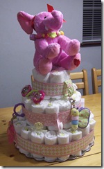
 I have been busy the last two days putting these baby shower creations together. A co-worker is pregnant and she is moving to New York. We are having a shower tomorrow for her. First is the centerpiece which is a diaper cake. You can find a fabulous tutorial by Susan Liles if you click on her name. We know the baby is a girl hence the pink theme (wink).

100_1938

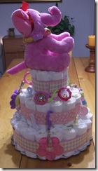
100_1939 Here are a few more shots of the diaper cake from different angles.

100_1940

There are pacifiers, teething rings and rattles all around it. It went together really fast. The paper is from the Baby Girl Nursery pack (thanks again Char).

And now for the shower favors:

100_1941 Aren’t these baby booties too cute? These did take a bit longer to trace, cut and glue together but I think they are worth it. They are made from a variety of patterned papers with cardstock bottoms. Here is a close up”

100_1944

They are filled with pink and white M&M’s. A small brad holds the strap so it really resembles a shoe! Now to just wrap my present, fix my cold cut platter and make a card. This is very hard to concentrate on as I am watching the American Idol results show.

Til next time :)

Wednesday, March 10, 2010

Wacky colors and early birthday gifts


daisy with flowersoft

Do the colors of the above card look wacky to you? I must state, the shade of purple is not really coming through on this picture. Today is wacky color Wednesday at 365 Cards. We needed to use Orange, Purple and Blue. I began with looking for some patterned paper and found some scraps from Basic Grey Sugar Rush. The image is a RAK that I received from a stamping friend in the UK (thanks Joan) and I believe it is a Sugar Nellie image. I colored her with these copics:

100_1931

I added some ultrafine Flower Soft in Citrus Crush to the flowers. A strip of ribbon and pearls were added along with a butterfly punch. The sentiment is by A Muse and stamped on a Labels 4. I am also going to submit this card to Challenge 94 Recycle at A Spoonful of Sugar and Challenge 100 at Flutterby Wednesday. All three of these challenge blogs have some wonderful creations for you to look over.

I would also like to show you some early birthday gifts from my stamping buddy Char:

100_1933Isn’t that card wonderful? She knows my love of butterflies (especially blue ones). I can’t wait to try that pop-up butterfly punch!!! The big day is actually this Sunday, sigh.

Song inspired Mojo 129

 Today’s card fulfills two challenges. The first is the Mojo Monday sketch challenge and the second is from 365 Cards who gave us a song to be inspired by. The song is What a Wonderful World. I went with the first part of the song when Mr. Armstrong sings of the trees and roses. If you would like to hear the song, click on the blue words above that say 365 Cards and it will start playing for you.

100_1923

The card itself is not very complicated. I was a bit pre-occupied when I made it last night. I had come home from a city council meeting and was playing catch up on some shows I missed last week. I began with just a plain white card base and put a layer of Sweet Blush from Papertrey Ink on top. The patterned papers are from Basic Grey. I stamped the roses (Hero Arts) and colored them with my copics. The sentiment is by Justrite. The ribbon is silk and the buttons are also from BG so the color matches perfectly! I tried layering the stamped panel on a few different shades of cardstock but none of them gave me the wow factor, so in the end I just used my Tim Holtz distresser and left it at that.

I hope you enjoy your Wednesday otherwise known as Hump Day! The week is all downhill from here:)

Monday, March 8, 2010

Imagine this…

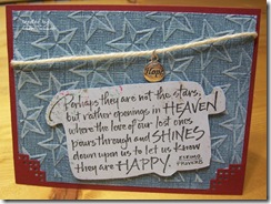
 Today’s challenge at 365 cards was to imagine outer space. I knew I did not have any cute alien creatures or space ships so I went a different route. There are times we should march to the beat of our own drum, so I am marching here. I have loved this saying ever since I was given a card with it after my Dad passed away. I would like to think that he is up there in the heavens watching down on my family. When I think of outer space, yes the first thought is planets and rockets, but also Heaven.

100_1922

The card itself is very simple. I began with my stars cuttlebug folder and used some Coredinations cardstock from the Vintage Flower Power pack. I sanded the cardstock so you could see the stars shining through. I stamped the sentiment (from Inky Antics) on a piece of scrapbook paper from the Complete Boy pack by My Minds Eye. A layer of dark red is behind it and I punched a corner punch by EK Success so you could see through the cardstock. A simple piece of twine holds the charm Hope.

I hope that I am able to hold onto this card for awhile and that I am not having to send it to a friend too soon.

Sunday, March 7, 2010

A few days for 365 Cards

I have tried to play catch up today. With our son getting into his new home, we have spent each evening with him doing small tasks. I have three cards tonight to show for some of this week’s challenges. First up is today’s Sunday Sketch by Pam. I began by using my new paper pack from  

sketchy sun mar 7

SEI called Claire. All three patterned papers on the cover are from the pack. I used my new Labels 12 from Spellbinders to cut out the shapes. In keeping with the curve of the label, I used an SU label and a corner rounder that attempted to mimic the curve. A strip of silk ribbon and a few button from Dress It Up finish the bottom. I didn’t want to drag out my huge sewing machine for the stitches, so I used my paper piercer and created some faux stitches.

Next up is a card for Day 6 stampin saturday. We were required to put ink on our stamps not color in a stamped image. Yikes! I rarely make a card without using my Copics anymore, this seemed so strange. I found this piece of background paper that was made with the shaving cream technique some time ago.

watercolored flower

I looked at the colors I had used to create the background (Raisin, Butterscotch and Ginger) and dragged out my watercolor pencils. I used a stamp from Penny Black ( I just adore their floral stamps) and put the crayon color directly on the stamp then misted it with water. The sentiment is from SU and the flowers were punched from a SU floral punch. I added half pearls to their middles. Ladies, please close your dropped jaws, there are no nesties used on this card either. I went the old school way and just used my paper cutter to cut simple edged shapes.

For my last challenge, Day 5 Fancy Folds, I got out one of my wild card templates that I have had for years. Let me show you the card, then I will explain.

petaled card petaled part 2petaled part 3

I began by using some material that was left over from the Wild Card class I had attended many moons ago. I glued the fabric onto some light cardstock and cut out the two templates that you see in the first and third picture of this section. Eyelets and copper leaves were attached to the third template. Inside is a small note card. The middle template is from a sheet of paper that I stamped a variety of leaves in Ranger Raisin ink. The top template has crushed velvet leaves on the four petals that open the envelope. Hopefully, the recipient doesn’t get tired of opening all the cards up to get to the sentiment inside!

It is time for a hot chocolate and a cinnamon raisin bagel while I catch up with some recorded shows from this week. I hope you all have a fun week coming up. If our schedule stays on track, we are driving up to Atlanta on Saturday to move our oldest. I will get to spend an evening with my sister and bring her Cuttlebug to her. She has been hearing about this machine for quite a while and I was able to get one for her quite cheaply.

Thursday, March 4, 2010

My Lavender space challenge

 Today at 365 Cards Pam challenged us to a white space challenge. Since I used a lavender cardbase, mine is called the Lavender space challenge. I made this quick and easy because I spent my evening helping our middle son get organized in his new house.

100_1909

The card details are: cardstock – Papertrey Ink Lavender Moon, ink – Versamagic Purple Hydrangea, stamp – Studio G, ribbon – May Arts, bling – Basic Grey, Nestie – New Label 10 :)

Here is what the challenge looked like and you can see what some of the others did with it. That’s it for tonight….I am off to bed.

Tuesday, March 2, 2010

Tuesday Trio….Follow Your Heart

 When you look at this picture can you figure out what the trio of elements we needed to use were? It is Day 2 at 365 Cards and Pam had a fun trio for us today.

100_1908

So, did you guess circles, silver and pearls? Then you are a winner! Here is the entire card for your viewing pleasure:

100_1906

I began by using my Blooming Dots CB folder on a piece of Coredinations Flower Power paper. I sanded the panel so the dots would pop out and be seen. I used my SU scallop border punch on the right side and used a strip of silver ribbon to attach the heart charm. The sentiment is from Justrite Joyful Hearts set. After cutting out some ovals for the sentiment I used Silver Liquid Pearls on the scalloped layer. I know it is a simple card, but I rather like it. 

American Idol comes on with the 10 remaining girls tonight. I don’t have a favorite just yet, but hopefully they won’t be as nervous as last week:)

Monday, March 1, 2010

Mojo in colors

 Good Evening. This is a short post tonight to show the card I just finished after dinner. It uses the color challenge from 365 Cards and the layout from Mojo Monday #128.  The sketch was a more simple one which is good since I am using some busy patterned paper. It is a new year at 365 Cards and it began with a color challenge. You can view the challenge here.

100_1904

I began with a base of SU Chocolate Chip and put down a layer from Basic Grey Ambrosia paper pack. The butterfly strip is also from the same pack. In keeping with the colors required I added strips of SU Close to Cocoa. The sentiment is Justrite from the Just A Note set which is stamped and embossed on vellum. I layered the circle on a nice red flower and finished it with some chocolate dew drops to complete the sketch layout. This came together really quick….maybe I should submit it to Take Ten Magazine?!

G’Night :)